July 28, 2026
Enhanced Conversions Guide: Setup & Best Practices
Enhanced Conversions Guide This enhanced conversions g...
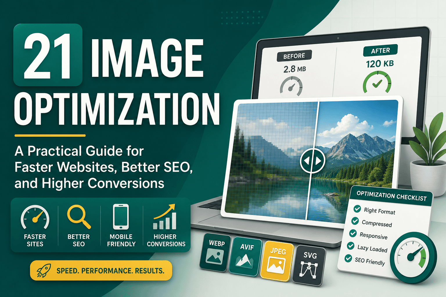
Image optimization is the process of reducing image file size, choosing the right image format, resizing images correctly, improving how images load, and adding useful metadata so your website becomes faster, easier to use, and more search-engine friendly. Images are often among the largest assets on a web page, which means poor image handling can slow down load times, hurt user experience, increase bounce rates, and make your site perform worse in search results.
Good image optimization is not simply about making images smaller. It is about finding the right balance between visual quality, file size, performance, accessibility, and SEO. A product photo should still look sharp. A hero image should still feel professional. A blog image should still support the content. But none of them should be heavier than necessary or loaded before they are needed.
This guide explains how image optimization works, which formats to use, how to compress images, how to improve image SEO, and how to build an ongoing workflow that keeps your website fast as it grows.
Images affect almost every part of website performance. Large, uncompressed images can delay page loading, consume more bandwidth, create a poor mobile experience, and reduce the likelihood that visitors stay on your site. On ecommerce websites, slow product images can directly affect sales. On service websites, slow pages can reduce lead generation. On blogs and content websites, slow loading can reduce engagement and organic visibility.
Image optimization supports several important goals:
If your website runs on WordPress, image optimization should be part of a broader performance strategy. For a wider technical approach, see this WordPress speed optimization guide, which explains how hosting, caching, plugins, code, and assets work together to improve load times.
When a visitor opens a page, the browser downloads many assets: HTML, CSS, JavaScript, fonts, tracking scripts, videos, and images. If the page contains several large images, each one adds weight to the page. A single uncompressed image from a camera or design tool can be several megabytes. Multiply that by a homepage slider, blog thumbnails, product galleries, and background images, and the page can become unnecessarily heavy.
Images can also affect speed in more specific ways:
For websites focused on search visibility, image optimization also connects closely with Core Web Vitals. If you are trying to improve LCP, INP, and CLS, this Core Web Vitals guide provides a useful framework for understanding how real users experience page performance.
Before improving your images, it helps to understand the most common mistakes. Many websites are slow not because they use images, but because those images are uploaded and displayed without a clear process.
Modern cameras and phones create very large images. A photo may be 4000 pixels wide, but your website may only display it at 900 pixels wide. If you upload the full-size version and let the browser shrink it visually, users still download the oversized file. This wastes bandwidth and slows loading.
Different image formats are designed for different use cases. A photograph, logo, icon, screenshot, and transparent graphic should not always use the same format. Choosing the wrong format can create files that are much larger than necessary.
Large sliders, decorative background images, and unnecessary visual effects can create heavy pages. If every slide contains a large image and several of them load immediately, the page may become slow before users interact with it.
When image width and height are missing, the browser may not reserve the right amount of space before the image loads. This can cause layout shifts, which create a poor experience and can affect Core Web Vitals.
Alt text should describe the image for users who cannot see it and provide relevant context for search engines. Many websites either leave alt text blank for important images or stuff it with keywords in an unnatural way.
Images far down the page do not need to load immediately. Lazy loading delays offscreen images until users approach them, which reduces initial page weight and improves perceived speed.
Choosing the right image format is one of the most important parts of image optimization. The best format depends on the image type, browser support, transparency needs, animation, and quality requirements.
JPEG is commonly used for photographs and complex images with many colors. It supports strong compression and is widely compatible. However, JPEG is lossy, meaning some image data is removed during compression. If compressed too aggressively, images may appear blurry or distorted.
Use JPEG for:
PNG is useful for images that need transparency or sharp edges, such as logos, icons, interface graphics, and screenshots. PNG files can be much larger than JPEGs for photos, so they should not be the default choice for every image.
Use PNG for:
WebP is a modern format that can provide excellent compression while maintaining good visual quality. It supports both lossy and lossless compression, as well as transparency. For many websites, WebP is a strong default format for optimized images.
Use WebP for:
AVIF is a newer image format that can produce extremely small files with good quality. It is excellent for performance, but encoding can take longer and compatibility should be considered depending on your audience and website setup.
Use AVIF for:
SVG is a vector format, which means it scales without losing quality. It is ideal for simple graphics, logos, icons, illustrations, and shapes. SVGs should be used carefully and sanitized when uploaded to a CMS because they can contain code.
Use SVG for:
The best image optimization workflow starts before images are uploaded to your website. If you upload oversized, uncompressed files and rely only on a plugin to fix everything, your media library can become messy and inefficient.
Resize images based on how they will be displayed. If your blog content area is 900 pixels wide, there is usually no need to upload a 3000-pixel-wide image for a standard in-content photo. For retina screens, you may upload larger versions, but the size should still be intentional.
Common image width guidelines include:
Do not rely only on CSS to force images into awkward containers. Crop images to the right aspect ratio for their intended use. This improves visual quality, reduces unnecessary file size, and prevents important parts of the image from being cut off.
Compression reduces file size. Lossy compression removes some visual data to create smaller files, while lossless compression reduces size without noticeable quality loss. For most website photos, moderate lossy compression is acceptable because it produces a much smaller image with minimal visible difference.
Use descriptive file names instead of generic camera names. A file called blue-running-shoes-women.webp is more useful than IMG_4829.jpg. Descriptive file names help with organization and can provide additional context to search engines.
Camera metadata can include details like device model, location, exposure settings, and timestamps. This may increase file size and may not be needed for web use. Most optimization tools can strip unnecessary metadata automatically.
Image optimization is not only technical. Images can also support search visibility when they are named, described, placed, and structured correctly. Search engines use surrounding content, file names, alt text, captions, page context, and structured data to understand images.
Alt text should describe the image in a useful and natural way. It should help users understand the image if it does not load or if they use screen readers. Avoid keyword stuffing. The primary goal is accessibility and clarity.
Examples:
Image file names should be short, clear, and relevant. Use lowercase letters and hyphens between words. Avoid spaces, special characters, and meaningless file names.
Examples:
Images should support the surrounding content. If an image explains a process, chart, product, or concept, place it near the paragraph where that topic is discussed. This helps users and search engines understand the relationship between the image and the page content.
Captions are not required for every image, but they can be useful for charts, screenshots, product comparisons, diagrams, and educational content. Many users scan captions, so they can improve engagement.
If important text is embedded inside an image, search engines and screen readers may not interpret it properly. Use actual HTML text for important headings, descriptions, calls to action, and product details. Images should support content, not replace essential content.
Responsive image optimization means serving images that fit the user’s screen size and device. A mobile visitor should not need to download the same large image intended for a desktop monitor. Responsive images help reduce page weight and improve performance across devices.
Modern websites can use responsive image techniques such as:
WordPress automatically creates multiple image sizes when you upload media, but the quality of the outcome depends on your theme, builder, plugins, and how images are inserted into pages. A clean setup should avoid forcing mobile users to download oversized desktop images.
Lazy loading delays the loading of images until they are close to appearing in the user’s viewport. This improves initial page load because the browser does not need to download every image immediately.
Lazy loading is especially useful for:
However, lazy loading should be used carefully. Your above-the-fold hero image should usually not be lazy-loaded if it is the main visible element on the page. Lazy-loading the Largest Contentful Paint image can delay rendering and make the page feel slower.
Hero images are often the largest and most important images on a page. They are usually visible immediately when the page loads, which means they can have a major impact on perceived speed and Core Web Vitals.
To optimize hero images:
If your website uses a CDN, hero image delivery can also improve for users in different locations. This CDN explained guide covers how content delivery networks work and why they can make images, scripts, and other static assets load faster globally.
Ecommerce websites depend heavily on images. Product photos, category thumbnails, banners, lifestyle images, logos, trust badges, and review images all influence buying decisions. But ecommerce pages often become slow because they contain many images per page.
For ecommerce image optimization, focus on both performance and sales quality. Product images must be clear enough for customers to inspect details, but they should also load quickly enough to avoid losing impatient shoppers.
Category pages can contain dozens of product thumbnails. If each image is too large, the page becomes heavy quickly. Use properly sized thumbnails and avoid loading full product images in listing views. The browser should only download the size needed for the grid or list display.
For WooCommerce stores, image optimization should be part of the overall launch and performance process. This WooCommerce store checklist includes broader steps for performance, SEO, analytics, security, and store readiness.
WordPress makes it easy to upload images, but easy uploading can lead to poor media management if there is no process. Over time, websites often collect unused images, duplicate files, oversized uploads, and plugin-generated thumbnails that are no longer needed.
Plugins can help automate compression, WebP conversion, lazy loading, and image resizing, but too many plugins can slow your site or create conflicts. If you are reviewing your plugin stack, this guide to WordPress plugins you actually need can help you choose tools more carefully.
The right compression level depends on the image. A detailed product photo may need higher quality than a decorative background. A screenshot with text may need sharper edges than a lifestyle image. The goal is to reduce file size without visible damage that hurts trust or usability.
As a general rule:
A good test is simple: view the image at the actual size users will see it. If the compressed version looks nearly identical but is much smaller, the optimization is successful.
Use this checklist when auditing images on your website:
There are many tools that can help with image optimization. The right combination depends on your platform, workflow, and technical comfort level.
These tools help you resize and compress files before they reach your website. They are useful for designers, marketers, and content teams who want more control over quality.
These tools optimize images after upload or during delivery. They are especially useful for WordPress and ecommerce websites where many people may upload content.
Testing tools help you identify oversized images, layout shifts, slow-loading assets, and opportunities for improvement.
If your website already has hundreds or thousands of images, image optimization may feel overwhelming. Start with the pages that matter most instead of trying to fix everything at once.
Image optimization can go wrong when teams focus only on file size and forget about usability, design, or maintenance. Avoid these common mistakes:
Image optimization supports SEO in several ways. Faster pages create a better user experience, and search engines can use performance signals as part of evaluating page quality. Properly described images can also appear in image search results, support topical relevance, and make content more accessible.
Key SEO benefits include:
Image SEO should never be treated as a shortcut for ranking. It works best when combined with strong content, clean technical structure, fast hosting, internal linking, and a useful page experience.
Image optimization should be an ongoing process, not a one-time task. Every new blog post, landing page, product page, and portfolio item adds new media to your website. If your team does not follow a consistent process, image performance can decline over time.
A good image optimization schedule includes:
Before publishing any important page, review this quick checklist:
Image optimization is one of the most effective ways to improve website speed, SEO, user experience, and conversions. Because images are often the largest assets on a page, even small improvements can make a noticeable difference. The best approach is to resize images before upload, choose the right format, compress files carefully, use responsive image delivery, lazy-load non-critical images, and write helpful alt text.
A fast website is not created by one setting or one plugin. It comes from a consistent process. When image optimization becomes part of your publishing workflow, your pages load faster, your visitors have a better experience, and your website becomes easier to scale over time.